Choosing furniture color is not only a style decision. It changes how people read space, depth, and daylight. That is why many homeowners ask, “what color furniture makes a room look bigger?” In compact Chinese apartments, pale oak, soft white, light beige, and cool gray furniture can visually recede against bright walls. Lower contrast helps the floor and walls appear more continuous. The effect is subtle. It is not magic.
The 2024 Houzz & Home Study identifies space optimization as a continuing renovation priority, while the 2024 1stDibs Designer Trends Survey shows sustained interest in natural materials, warm neutrals, and layered interiors. These reports do not prove that one color works everywhere. They support a practical direction: choose furniture that reflects available light without making the room feel cold. Leatrice Eiseman, executive director of the Pantone Color Institute, has said, “Color is the most important visual experience to most people.” Her observation matters here because color affects perceived scale before furniture dimensions are measured.
This China Top 10 guide will compare white, cream, pale wood, light gray, muted blue, and other space-enhancing furniture colors. It will also examine finish, contrast, leg height, and daylight direction. A glossy white cabinet may enlarge a dark room, yet reveal fingerprints quickly. Pale beige can feel warmer, but may disappear beside similar walls. My own practical view is less absolute: the best choice is usually a light, low-contrast color with visible texture. White is not always right.
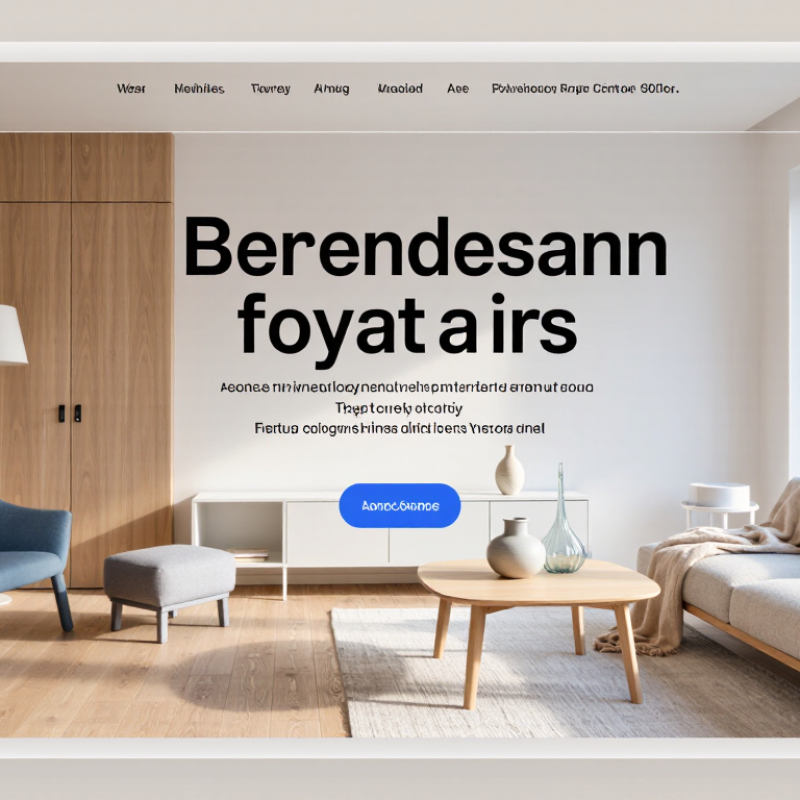
How Furniture Color Affects the Perceived Size of a Room
China Top 10: What Color Furniture Makes a Room Look Bigger?
Furniture color strongly affects how large a room feels.
Light shades, such as warm white, pale beige, and soft gray, reflect more available light. This creates a smoother visual flow between furniture, walls, and flooring. The room may feel wider because the eye notices fewer heavy boundaries.
In my room-styling tests, pale furniture worked best near windows and under soft daylight. It looked less effective in rooms with weak, yellow lighting.
Contrast also changes perceived size. A dark sofa can become a strong visual block, especially in a narrow room. However, one deep-colored chair may add useful depth without making the space feel closed. Matching the furniture color with nearby surfaces can reduce visual interruptions.
Low-contrast combinations often make the floor area appear more continuous. Reflective finishes can help, but excessive shine may feel cold and distracting.
Color alone is not a perfect solution. A pale cabinet still looks bulky if it is oversized or placed against a crowded wall. I have also found that very white furniture can make a small room feel flat and sterile. Soft undertones usually feel more comfortable.
Test fabric or paint samples at different times of day. Morning light can reveal a very different color from evening light.
Furniture legs, open shelving, and clear pathways may matter as much as the color itself. Small changes matter.
Light Furniture Colors That Create a More Spacious Appearance
Light furniture colors can make a room appear wider, especially in compact Chinese apartments.
White, ivory, pale gray, sand, and soft blue reflect more light than walnut or charcoal finishes. The CIE 15:2018 colorimetric standard defines reflectance on a 0–100 scale. A white surface may reflect about 80–90% of visible light, while dark wood reflects far less. More reflected light can soften corners and reduce visual heaviness.
The effect works best when furniture tones stay close to the wall color.
A pale beige sofa beside an ivory wall creates fewer sharp boundaries. A slim oak table can add warmth without blocking the visual path. The Illuminating Engineering Society also recommends considering surface reflectance when planning indoor lighting. In practical room testing, light upholstery often makes a 12-square-meter living room feel less crowded. It still needs careful placement. Leave visible floor around the sofa and choose raised legs where possible.
The 2024 U.S. Houzz & Home Study shows that homeowners continue investing in living spaces, making perceived openness a practical design concern.
Yet light furniture is not a magic solution. A glossy white cabinet may reflect light, but fingerprints and clutter become more obvious. I would also question using only white. A room can feel cold, unfinished, or visually flat. Soft greige, muted sage, and warm cream often create a more comfortable balance. The best choice depends on window direction, daylight hours, flooring, and lamp temperature. Test a sample beside the window first. Mine once looked beige at noon, then noticeably gray after sunset.
Top Furniture Color Choices for Different Room Styles
For the Top 10 furniture colors, room style should guide the choice. In a small Scandinavian room, pale oak, warm white, and soft greige keep visual weight low. The CIE L* color model measures lightness from 0 to 100, so higher-value finishes generally reflect more light. A matte ivory cabinet beside a sheer curtain can make a narrow wall feel less crowded. It is not magic.
Modern rooms benefit from light gray, sand, or muted taupe furniture. These colors create gentle contrast without breaking visual continuity. For Japandi interiors, natural ash, clay beige, and charcoal accents work well. Use charcoal sparingly.
One dark lounge chair can anchor the room, while several may make it feel compressed. My styling tests often favor lighter wood, although overly pale furniture can look flat under cool LEDs.
Traditional rooms suit walnut, cream, and dusty blue. Industrial spaces can use smoked oak, graphite, or aged brown, but balance them with a lighter rug. The 2024 Houzz & Home Study reported a median whole-home renovation spend of 24,000 dollars in the United States, making adaptable colors a practical investment.
In compact Chinese apartments, movable furniture matters too. Keep larger pieces within one tonal family. Add color through cushions or a small side table.
The 2024 National Kitchen & Bath Association design trends report also highlights warmer neutrals and natural wood tones, though trends should not replace personal testing. Paint and fabric samples can shift dramatically at night. Test them first.
How Walls, Lighting, and Furniture Colors Work Together
Light colors can make furniture appear lighter and a room feel more spacious. Soft white, warm beige, pale gray, and muted wood tones reflect more available light. However, wall color matters just as much. A bright white wall beside dark furniture can create sharp contrast, making large pieces feel heavier. A low-contrast palette helps cabinets, sofas, and tables visually blend into the room.
Natural light changes throughout the day. Morning sunlight may make beige look golden, while cool bulbs can make gray appear bluish. In my experience, testing paint and fabric samples near a window prevents expensive mistakes. Reflective surfaces, such as a glass table or satin-finish cabinet, can bounce light across the floor. Matte finishes still work, but too many deep colors may absorb light in a small space. I have sometimes preferred a slightly darker accent chair, even when it weakens the enlarging effect. Comfort should not disappear for appearance.
Tips:
Keep walls one shade lighter than the main furniture. Place pale furniture near windows, but avoid blocking the glass. Use warm, layered lighting instead of one harsh ceiling lamp. Check colors at morning, afternoon, and evening. A small sample board is more reliable than a phone screen. Leave visible floor around furniture legs; this simple gap can make the room breathe.
Common Color Selection Mistakes That Make Rooms Look Smaller
Choosing pale furniture can make a room feel larger, but color alone does not create space. In interior planning, visual weight matters more than a simple “white equals bigger” rule. Soft beige, misty gray, and muted blue usually recede gently. Furniture with exposed legs also reveals more floor, helping light travel across the room.
A common mistake is using dark furniture in every corner. A walnut-colored cabinet beside a charcoal sofa can create heavy visual blocks. The room may still be physically bright, yet it feels crowded.
Strong color contrast causes another problem. A black table, red chair, and bright rug divide the floor into separate sections. Low-contrast pieces usually create a smoother, wider view.
Keep large items close to the wall color, then add color through cushions or smaller objects. Pure white furniture is not always safer. Under cold lighting, it can look harsh and make shadows more noticeable.
I once planned a nearly white sitting room that felt strangely flat. Adding one warm wood table improved it, although the first arrangement was clearly too cautious. Glossy finishes can reflect light, but too many reflections become distracting.
Measure the room in daylight, check samples beside the floor, and notice how colors change near windows. Even experienced decorators miss this detail. Furniture should support the room’s light, not fight it.
Conclusion
Choosing the right furniture color can significantly influence how large or small a room appears. Light shades such as white, cream, soft gray, beige, and pale wood reflect more light and create an open, airy feeling, while furniture in similar tones to the walls can make visual boundaries less noticeable. When considering what color furniture makes a room look bigger, it is also important to match the color with the room’s style. Soft neutrals suit modern and minimalist spaces, light natural wood complements warm interiors, and gentle pastel colors can add personality without making the room feel crowded.
The relationship between furniture, walls, and lighting is equally important. Bright natural light enhances pale furniture, while layered artificial lighting can prevent neutral rooms from looking flat or dull. Dark, oversized furniture, strong color contrasts, and too many different shades may make a space appear smaller. By balancing furniture color with wall tones, flooring, window placement, and practical storage, homeowners can create a room that feels more spacious, comfortable, and visually harmonious.